
There has been an exponential rise in COVID-19 cases. There is no doubt we’re feeling the effects of that all over the world. Many people, especially it seems, the lay public and politicians, have a hard time understanding the meaning of ‘exponential’.

The scariness of exponential growth shown here with E.coli
Image by Stewart EJ, Madden R, Paul G, Taddei F (2005) / CC BY-SA
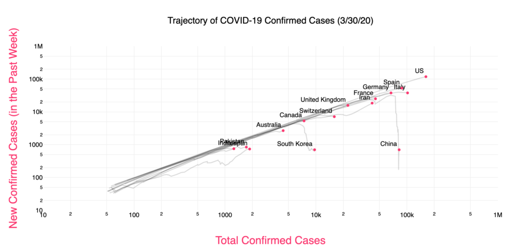
But can exponential rise continue? If cases double every 3-4 days, then based on today’s figures from the Johns Hopkins Dashboard (1st April) by May 6 there will over 8.7 billion people infected, which is more than everyone on the planet, and clearly impossible.
This means the rise must tail off eventually. In fact, the more people there are who are infected, the harder it is to find someone to infect with the virus who hasn’t already got it. Also, spread should be limited by the social distancing and other measures (such as handwashing).
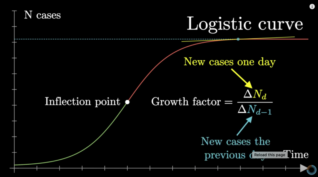
This actually gives rise to a LOGISTIC curve, rather than an EXPONENTIAL curve. This is an S-shaped curve that describes population growth (in both viruses and people) as well as other phenomena in economics and science(1).
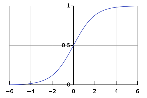
Notice in the above curve the mid-point marked 0.5. This is the inflection point when the rate of increase in cases stabilises before declining. Specifically, the ‘Growth Factor’, or number of new cases in one day divided by the number of new cases the previous day, equals 1. Note at this point cases are still increasing – the virus is still spreading – but it’s not accelerating, and therefore no longer on an exponential trajectory.
This isn’t the only model to describe pandemics and none is perfect(2). We still can’t predict what will happen with SARS-CoV-2 and we absolutely need to continue to enforce strict containment measures. But having a basic understanding of the data gives us ways to visualise it that allow comparisons, and show which countries have ‘fallen off’ the exponential rise curve.
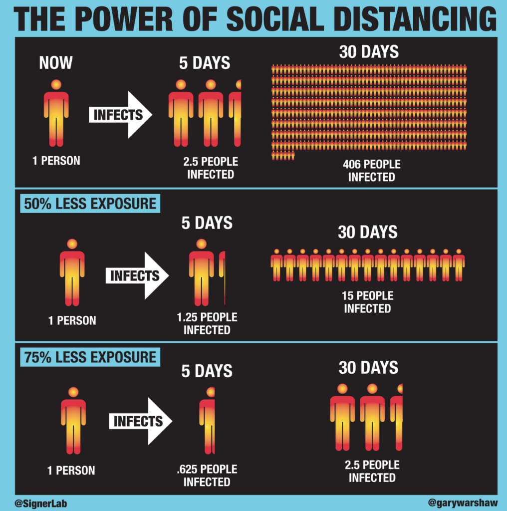
Since in most places, we are still on the exponential part of the curve, it is imperative to educate as many people as we can on the benefits of strict isolation and hygiene measures:
The best brief explanation of the above, which prompted me to write this brief post, is by the brilliant minutephysics
Take a few minutes to watch the video below:
Please note all the caveats at the end of the video. And one final one – I’m not an epidemiologist or mathematician. I’ve just been wrestling with what the endpoint of exponential rise would be and found these resources helpful.
References